
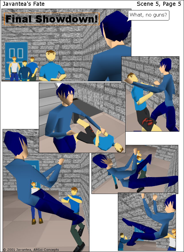
The long-awaited Page 5 of Scene 5: Final Showdown! I kinda like how it looks right now, even though the boxes still don't flow. Today's lesson is looks. If you're getting into the comic book making business, I have some very important ideas for you today. While a comic's plot is extremely important, aesthetics can make or break your plan. So if you are the drawer rather than writer, I encourage you to think about what look you are trying to achieve. With Javantea's Fate, I want a vibrant use of colors and 3d. I want people to look at it in it's digital format and be amazed at how beautiful it is. I want people to look like they act. I don't want any ugly people, places, or actions. It's important that lighting be maintained perfectly throughout so that no person's face is shaded out. But I don't want it to be washed out. Much of Javantea's Fate up to now is both. Trust me when I say that I'm going to redo all of JF up to now and even after. This is just a trial run and right now my lighting looks like arse. I'm working on fixing it -- big time. But when is it good to use poorly-lit scenes? Scary alleys, ugly places, and when characters are sleeping. When do you want washout (no shading)? For super-simplified scenes, very pretty people, and often background scenery. But one problem with very-low poly scenes is that the shading doesn't look very good. You see, the shading has to do with number of verticies in your model. If you have 400 verts rather than 800, you're going to have a poorly shaded model no matter what you do. So washout is acceptable for the majority of the model. But you should get shaded parts on the sides. That gives you a good 3d idea. Textures can give away 3d shading techniques, yet I don't want them in JF.
Don't forget this: tomorrow I'll have Scene 5, Page 6 for you. It's already done, I just want to give you a day to read this.
-
Leave a Reply


Comments: 0
Leave a reply »